Brisbane: papertiger Media Inc., 2006, 80pp.
This first book by Luke Beesley is the product of a deeply unusual poetic sensibility and it says something about the power of the book that it leaves a reader wondering what, if such an approach to poetry were to become endemic, Australian poetry would look like and whether or not it would be a good thing. If I wanted to describe it crudely I would say that it is a hyper-sensitive poetry that does not seem especially neurasthenic. The sensitivities are sometimes in conventional areas: lovers, films, weather, coffee-cafe life etc. Sometimes they are in less conventional areas: colour, the appearance of the dustjackets of books, the shape of letters and the tactile quality of individual sounds. All in all, the latter redeems the former, I think.
Lemon Shark is really a book of registration and placement. It is not strong on either intellectual analysis or its friend, syntax. You just aren’t going to find the tensions between sentence-construction and the displacement of lines that can give such exquisite pleasure in conventional lyric poetry both formal and free-verse. Lemon Shark simply does things in its own way. Take, for example, “Ink on Your Ankles”:
The angel architect made
you a kaleidoscope of pretty fame

Now arching over harmony
widening the canopy of the room
 the way you stand apart I thought

with a laugh that enters
like breeze to spinnaker. Suddenly a hug.

You walked through a rainbow you said
and a butterfly landed on your nose. Fancy

the depth of field
your exquisite world.

(Let’s not try to be truthful anymore. Make it all up.

Collapse all night.
Never faint again.)
This seems one of the less ambitious poems, a “couple” poem which is conceived almost entirely visually. Although the title recalls tattoos, most likely it is there because of the way it sounds or, even, looks: “ink” and “ankles” rhyme mysteriously visually as well as aurally. The girl is a kaleidoscopic and multicoloured intervention in an harmoniously shaded room and enters like someone who has walked through a rainbow and found pieces of colour sticking to her. She also seems three-dimensional in otherwise two-dimensional space – her “exquisite world” requires good depth of focus.
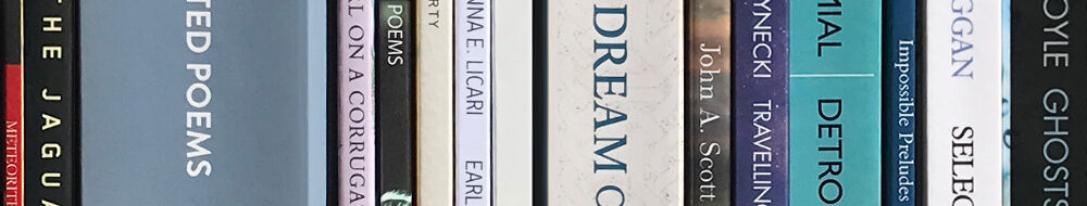
The poem next to “Ink on Your Ankles” is one of a series of prose-poems that are, by comparison, reasonably straightforward. It describes an architect who, in response to a storm darkening outside sets up his tools of trade under his desk. There he focuses on the patterns in the carpet –
Also little things in the carpet. A grain of sugar. A fraction of a leaf. The smell of owls, he thought.

His  eyes fell again on the bookshelf. The nurse-blues and nativity greens  of the spines. Poetry and a collection and fictions. A book Black Sea  and he imagined the sky splitting form the window and falling in a shard  of blue pool to the carpet.
Although this is not one of the major poems in the book, it is tempting to make it into a programmatic one. It moves from some sort of engagement with (or at least an irritable response to) the outside world to a disengagement whereby the arrival of the outside world is imagined. It seems to be saying that the creative concentration can (or should) be transferred to things within the immediate visual vicinity. More significantly these things have their conventional meaning stripped away – a process that is the dominant feature of Beesley’s poetry – so that books are reduced, not to their paraphrased meaning, or even effect on the reader, but rather to the colours of their spines and (though it is not specified in this poem) the shape of the letters on their cover. Even more worryingly, though this may not be deliberate, there is a sense of this process being one of infantilization since the colours of the spines recall nurses and nativities.
There is no excuse not to be prepared for this experience because Lemon Shark’s epigraph is a quotation from Clement Greenberg that recalls “The Architect”:
The intuition that gives you the colour of the sky turns into an aesthetic intuition when it stops telling you what the weather is like and becomes purely an experience of colour.
This method removes meaning from the poems and making them essentially visual or, sometimes, aural experiences. I’m not sure about this as a long-term aesthetic program. Stripping out prose-meaning may be a good thing but the history of poetry teaches us that there are many kinds of poetic meanings, or ways in which poems can mean in a non-prose way. At any rate, the aestheticization of words to the point where it is their shape, and the colour of the covers of the books they arrive in, that matters is, it has to be admitted, a very unusual poetic.
What kind of visual experiences are we dealing with here? The cover suggests that we should be alert for trompe l’oeil effects since what appears to be the rump of a dalmation turns out to be a woman’s shoulder from a Gerhard Richter painting. In practice the poems seem to focus on shapes and surfaces. “My Compliment is not a Tulip” seems to be about the interaction between shapes and other, more practical, calls on the attention.
The taper of a cup
sitting pretty in a circle -

there are shapes everywhere

The shape of sunlight cutting up your arm
The shape of stone
The shape of things to come
an owl’s rug-coloured call
One of the most attractive poems in the book “Happy Together (16 Poems)” is a response to the Wong Kar-Wai film, In the Mood for Love. It does not repeat many of the images of that film but does rejoice in its intensely visual approach to the couple’s relationship. In its obsession with the shapes of the woman’s body, with rising smoke and patterned walls, I read this poem as a mimicking of the film’s method: what might be sixteen scenes become sixteen poems though, interestingly, we are never quite sure where the dividing lines between the poems are. I hope this is deliberate and not just a result of the processes of typesetting the book because uncertainty about the beginnings and endings of scenes is one of the features of In the Mood for Love. The poem’s emphasis is on surfaces:
A red sheen trickles across
your shoulders as you move

your waist
it spills
It is no accident that a review of this film speaks of “a near constant state of ellipsis” and of how “a great deal is felt but very little is said” – that might itself be a description of Lemon Shark.
Finally there are aural shapes. A high degree of sensitivity to shape and surface is allied to a similar sensitivity to sound – and what is the sound of a word but the experience of it stripped of meaning. The book’s first poem speaks of “the noticeable twist / of sunlight in resist” and both “Fell” and “Eulila” are sound-driven poems. Probably the poem which addresses this issue most is “Juice”:
Listen,

- Je ne peax pas me faire comprendre

I have no idea what that means
but the important thing is to pronounce it perfectly.
This is all poetry is for me:
vague lessons in the pronunciation of a beautiful language,
and then a run into town to meet with the native tongue,
hoping to fluke conversations with everyone.

But that sounds superficial, almost.
It’s the opposite, actually.

Without spoiling it I want to know no French
but dress the absence, spray it with the tongue’s recipes
and let history emerge in the mind

like the swell of colour
happening in a fresh Polaroid.
“It sounds superficial, almost” is a brave admission and the idea that the meaning of events, “history” can emerge from this is an optimistic one but, as Auden said, perhaps we have to learn that surfaces need not be superficial nor gestures vulgar. Luke Beesley’s book may well turn out to be, in retrospect, one of the most ambitious books of recent Australian poetry
At any rate, as an object, Lemon Shark is, like the other books in this new series by papertiger (Brett Dionysius’ Universal Andalusia and Billy Jones’ Wren Lines), a thing of beauty in itself and all congratulations go to the team which has produced them. There is nothing superficial about the beauty of a well-made book.


